WEBSITE DESIGN & BRANDING
England Football branding,
Helping the FA differentiate
between products
MY ROLE
Lead UI designer
Branding
Art direction
Strategy
CLIENT
The FA
England Football
learning brand
Development
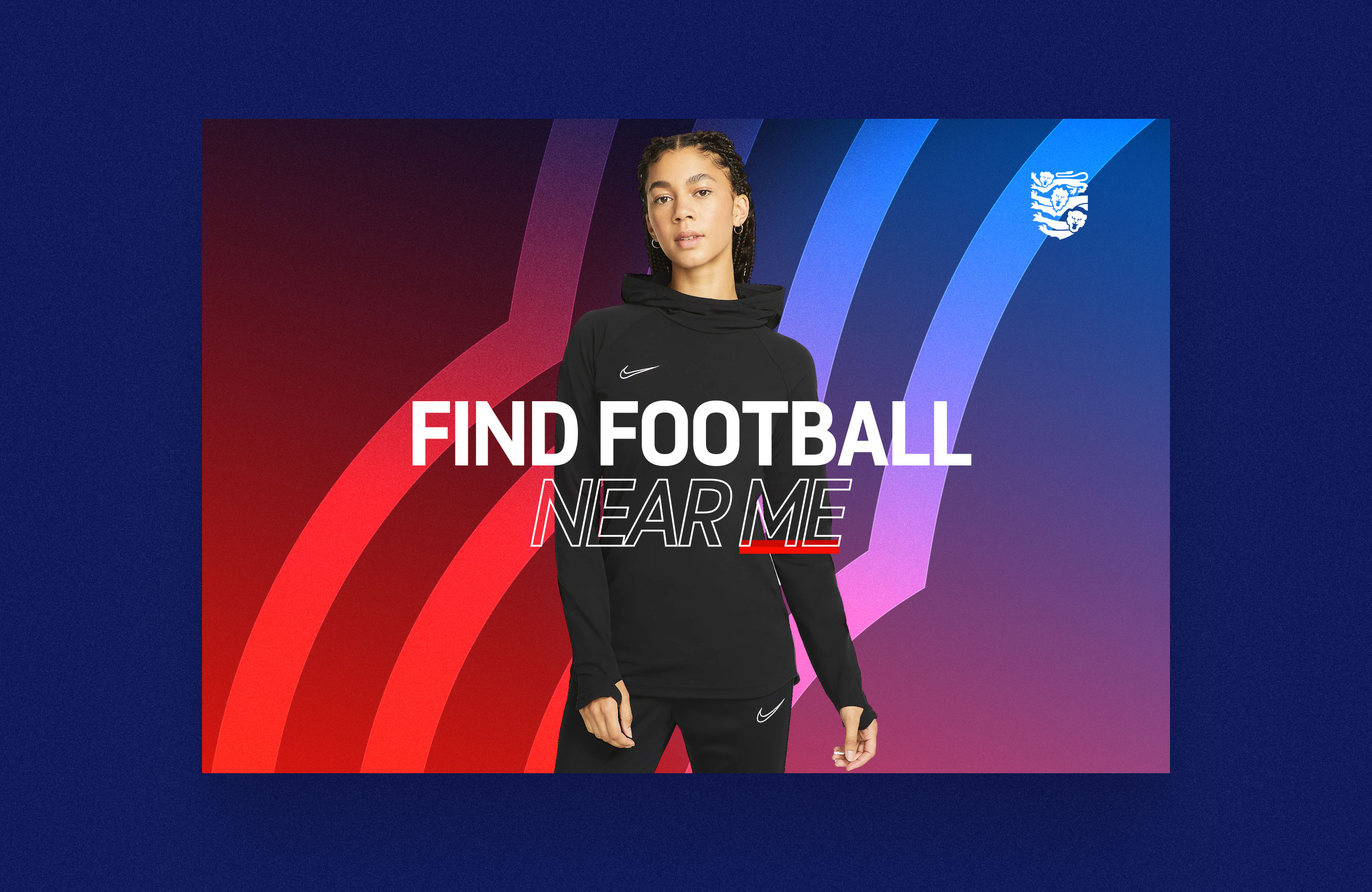
In 2020 the FA commissioned the creation of a new brand, England Football, a new fan-facing brand for The FA, (see find football case study for example). The England Football brand isn't always varied enough. We were limited with the assets we have been given and this can prevent our work from being as impactful as we would like.
With England football learning, we wanted to lay the foundations for the best creative output possible. By adding a few more assets and introducing a visual style to distinguish it from England Football.
Adding energy
I wanted to explore using more impactful branding elements in the hero areas of the new EFL site, to grab people’s attention and draw them into the content.
Foremost in my mind was injecting a sense of energy, movement, and dynamism. This is to reflect the fast-moving, ever-evolving world of football and the perpetual motion of the training pitch.
Connecting elite football
with grassroots
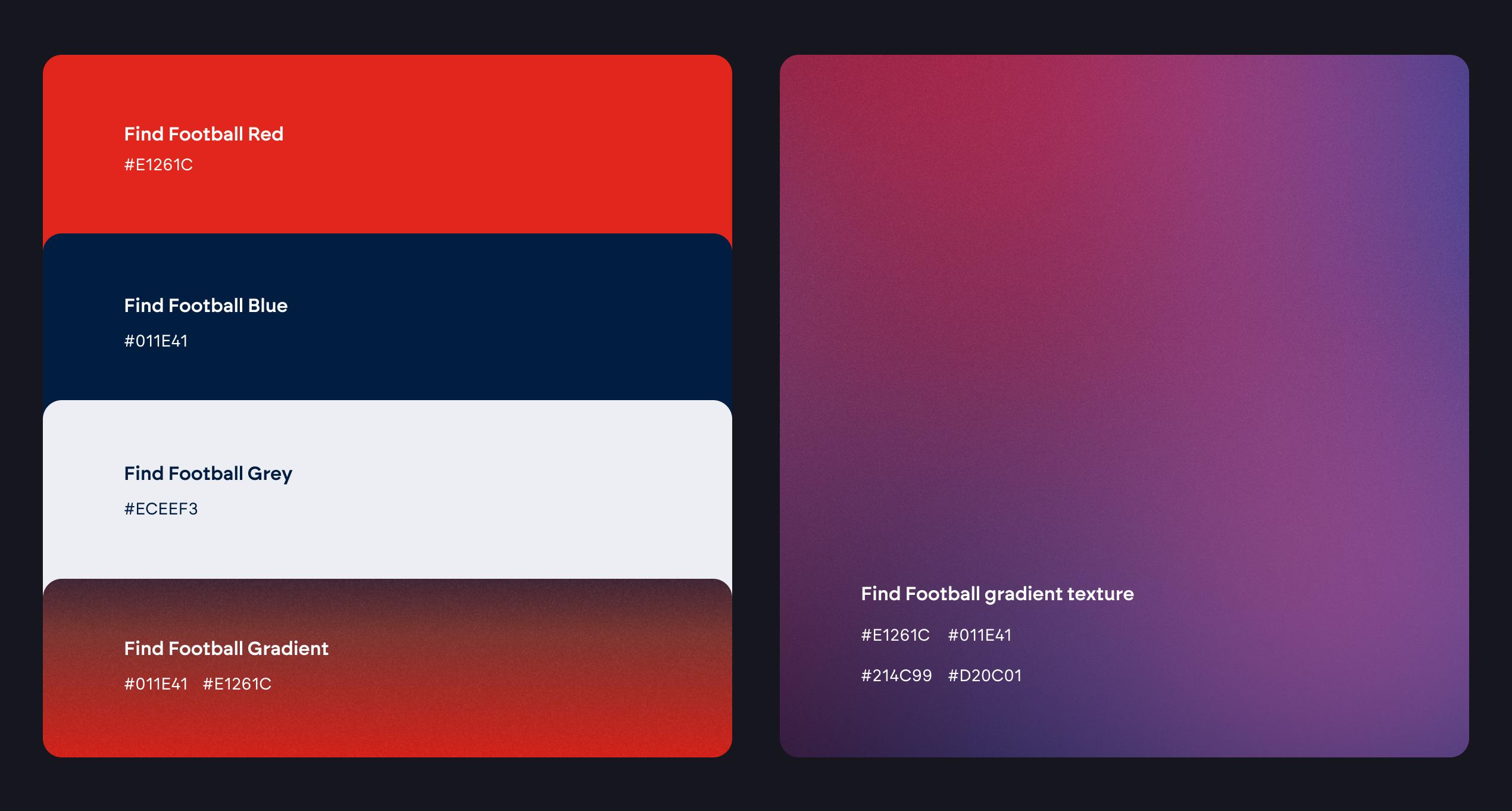
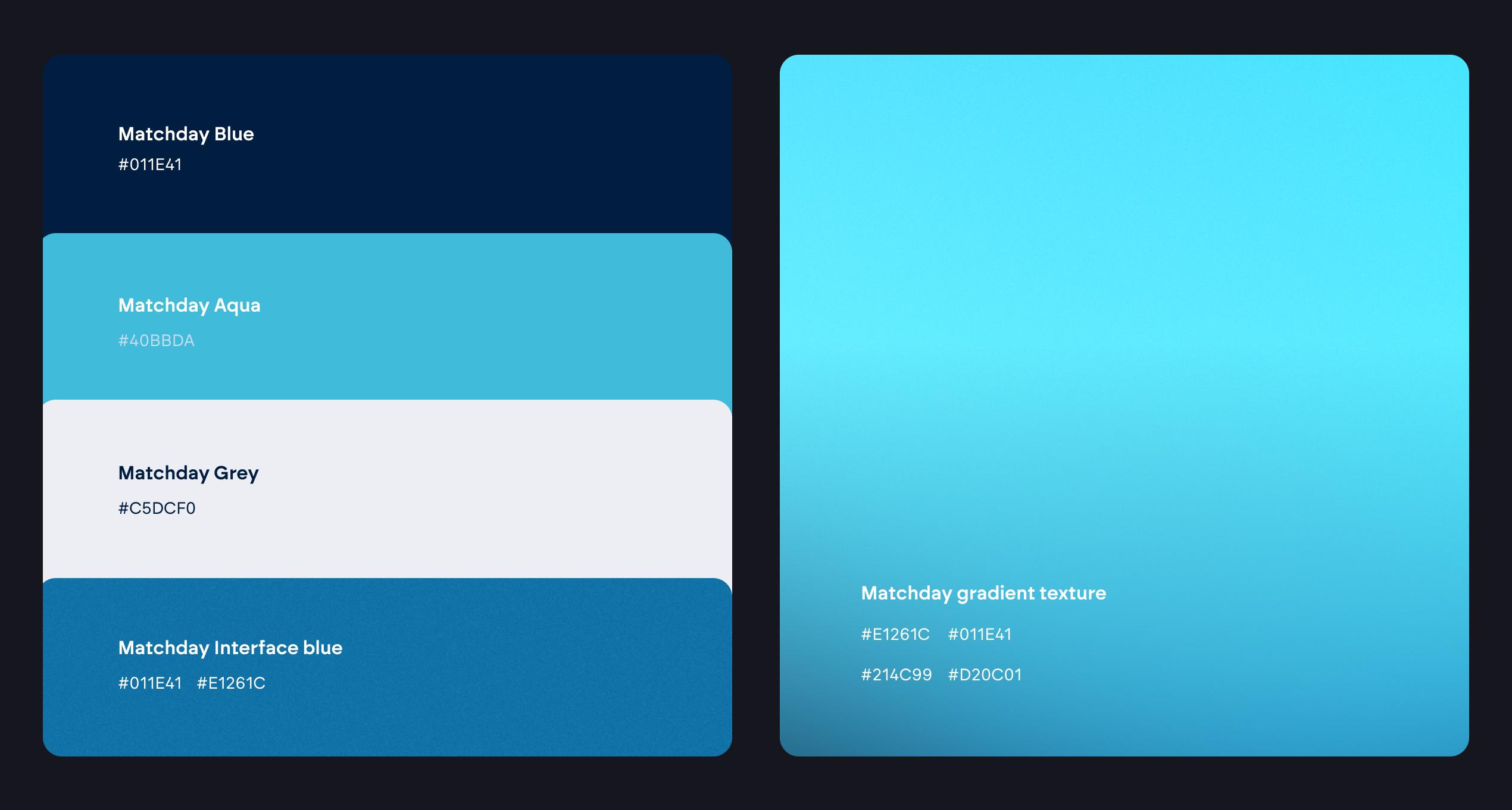
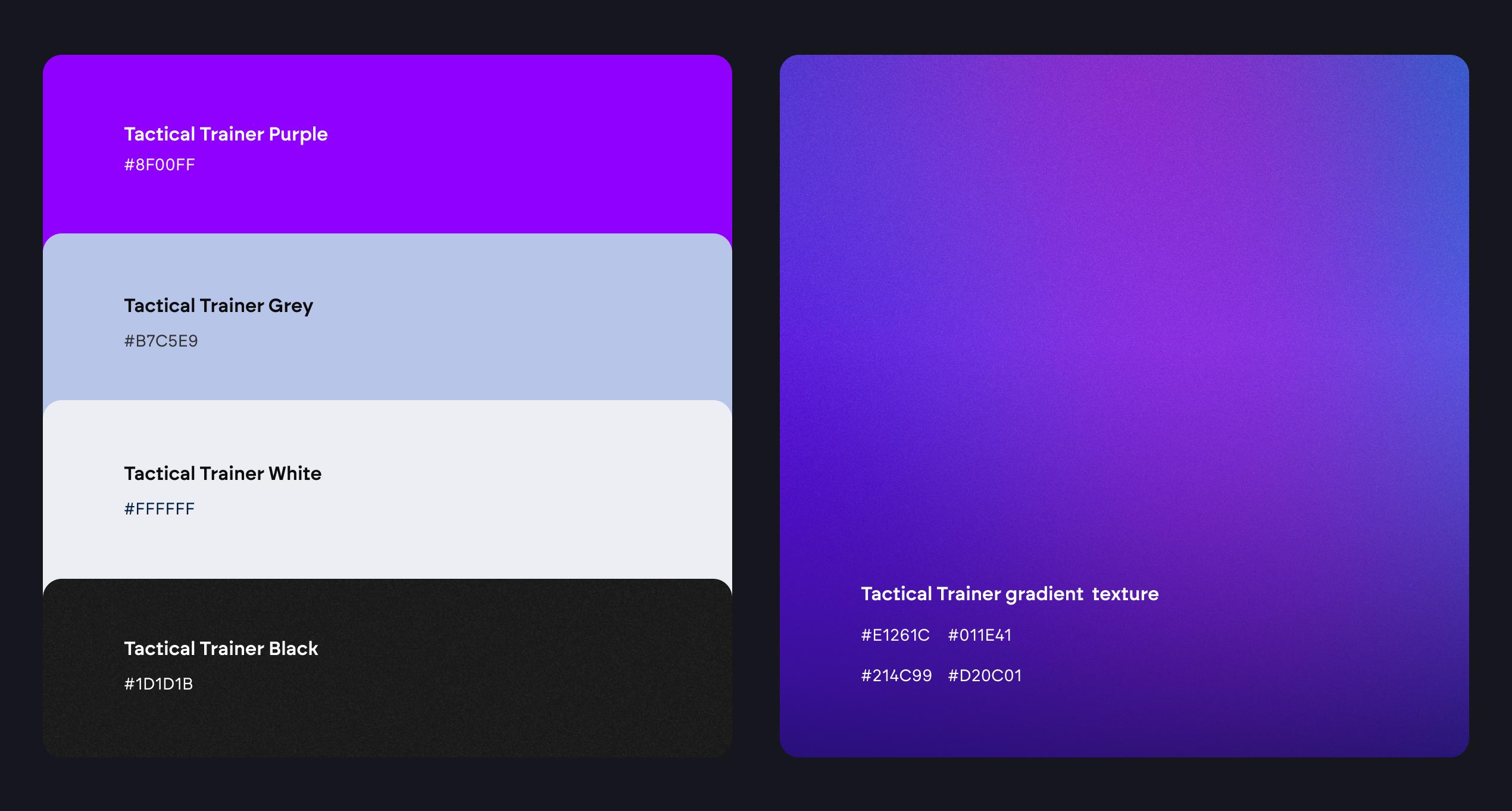
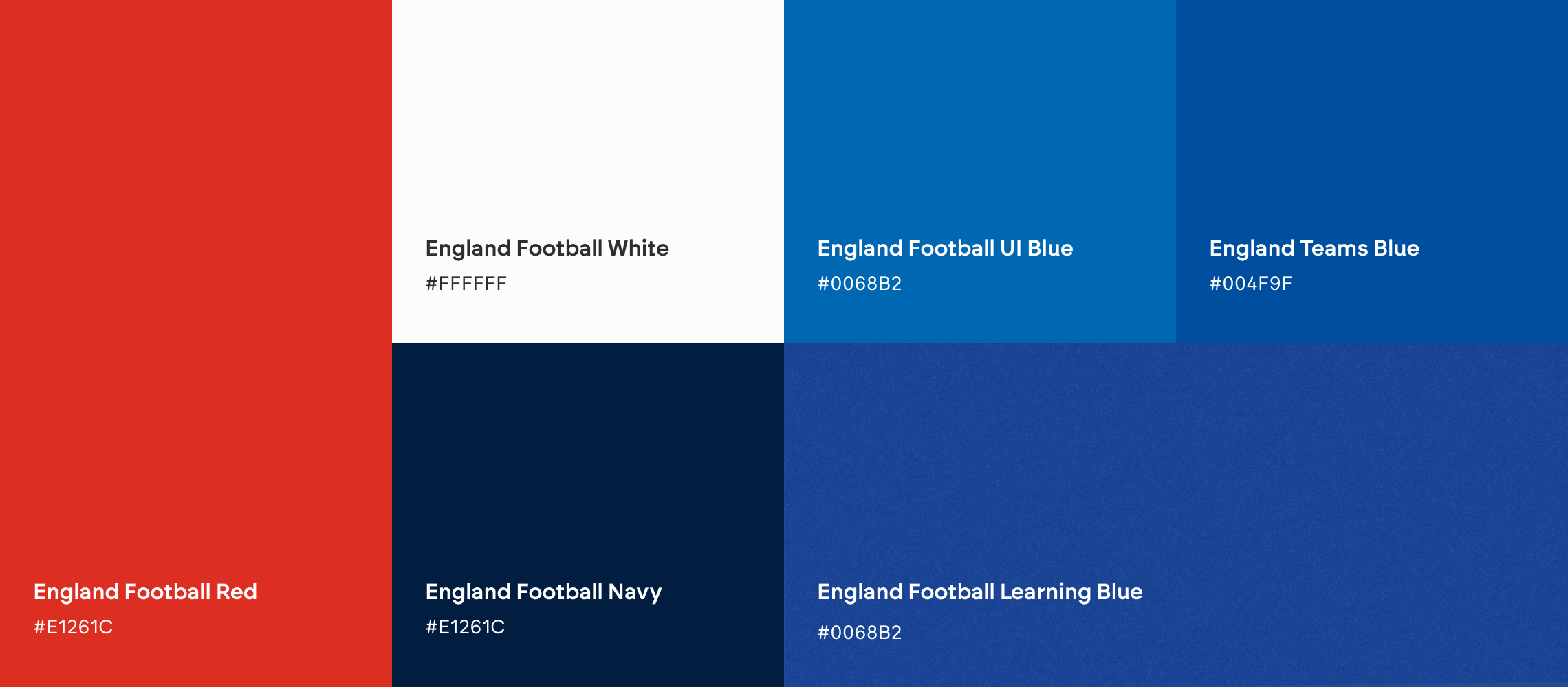
This combination of grassroots and England senior football has created a new primary colour: England Football Learning Blue. Tweaking the Interface Blue by adding a noise overlay has darkened the hue and allows it to sit between this and ET blue. The new colour bridges the gap between grassroots and elite – just as EFL will bridge the learning gap for prospective coaches, physios, referees and more.
Crucially from a design perspective, it also enhances imagery, shapes and accessibility, while again adding that touch of energy and dynamism.
Brand asset creation
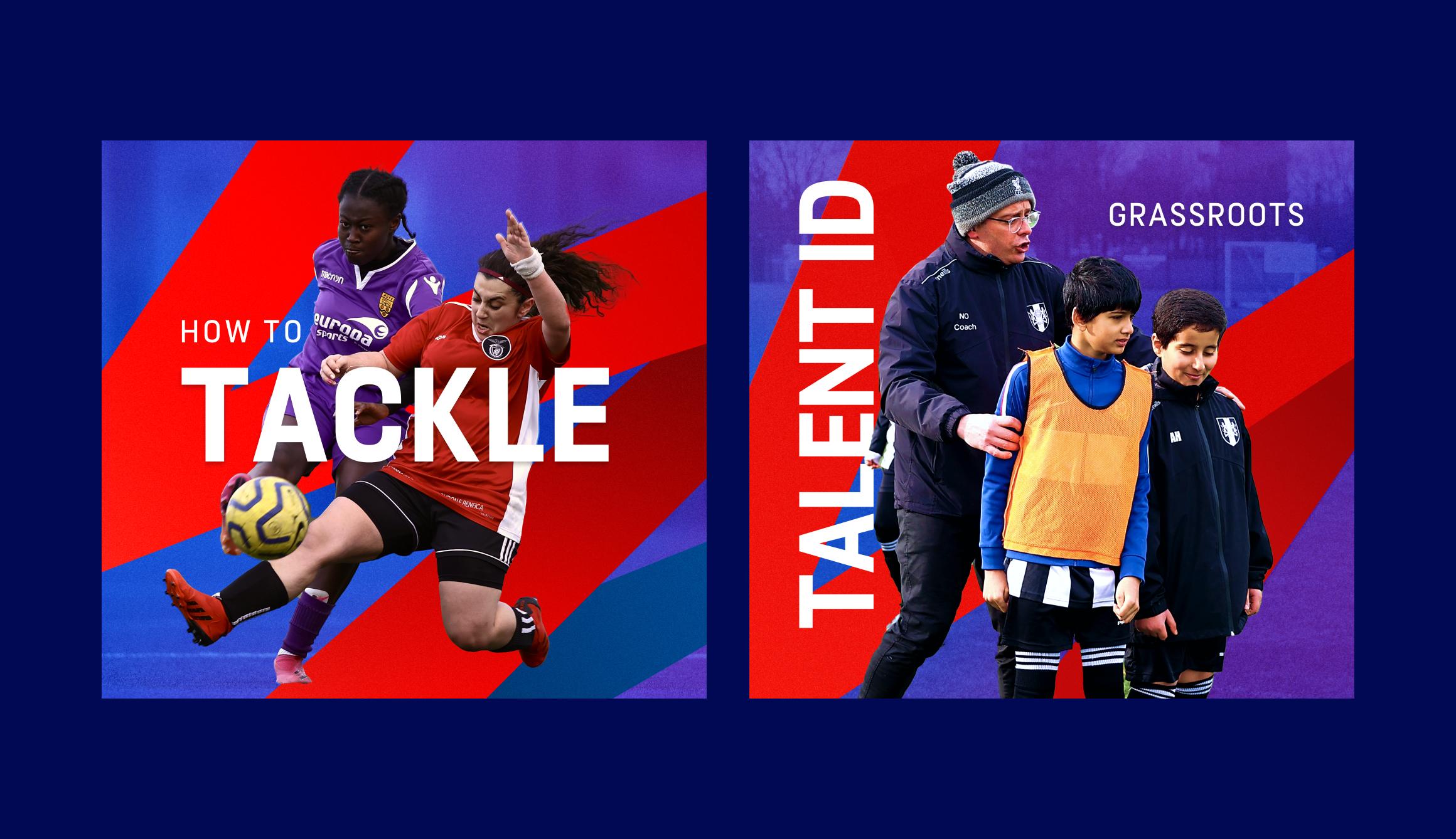
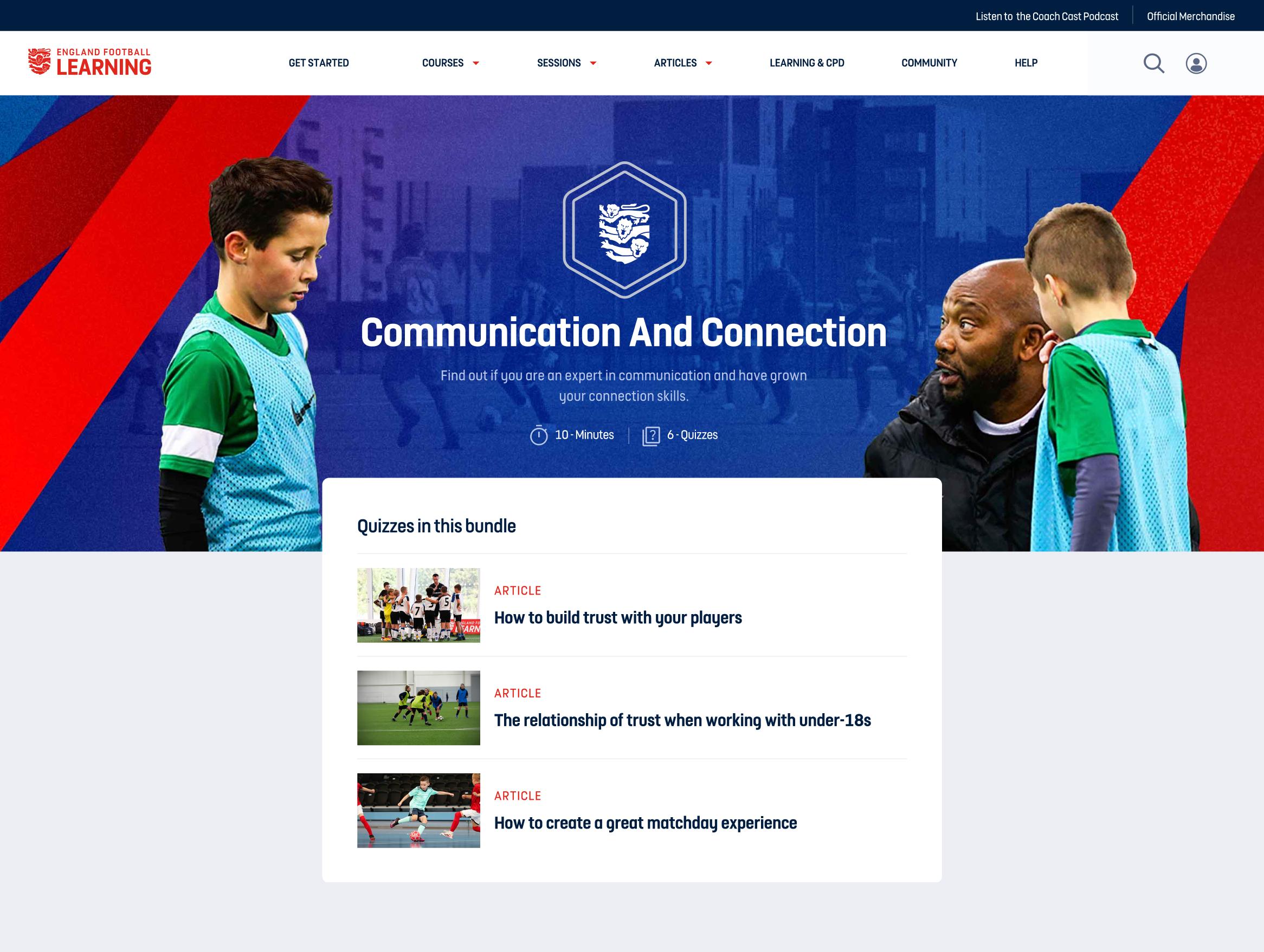
Inspired by patterns of movement during football matches and training sessions, we started to explore creating dynamic graphic shapes that represent these patterns of play.
This produced our new graphics, inspired by the tactics board and designed to give EFL an eye-catching and distinct visual style.
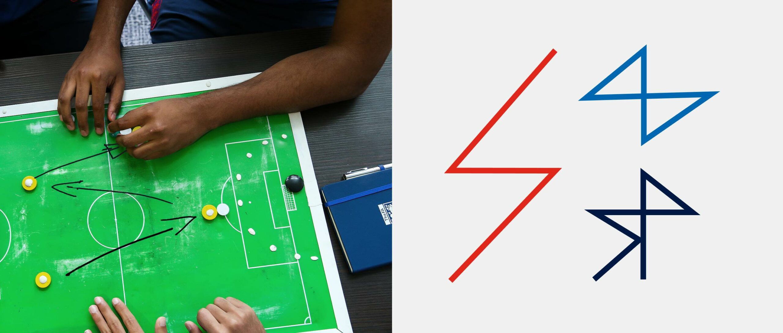
Shape studies based on patterns of play from the tactics board
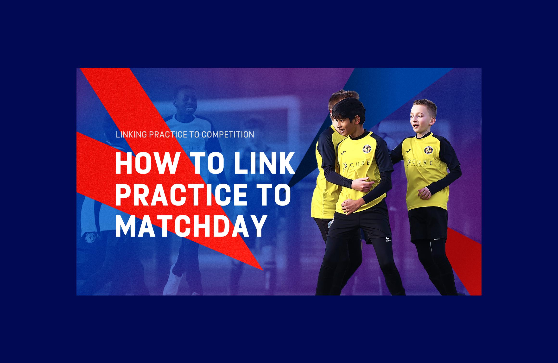
and training pitch shown above. These shapes were then developed into the dynamic EFL zig-zags featured below

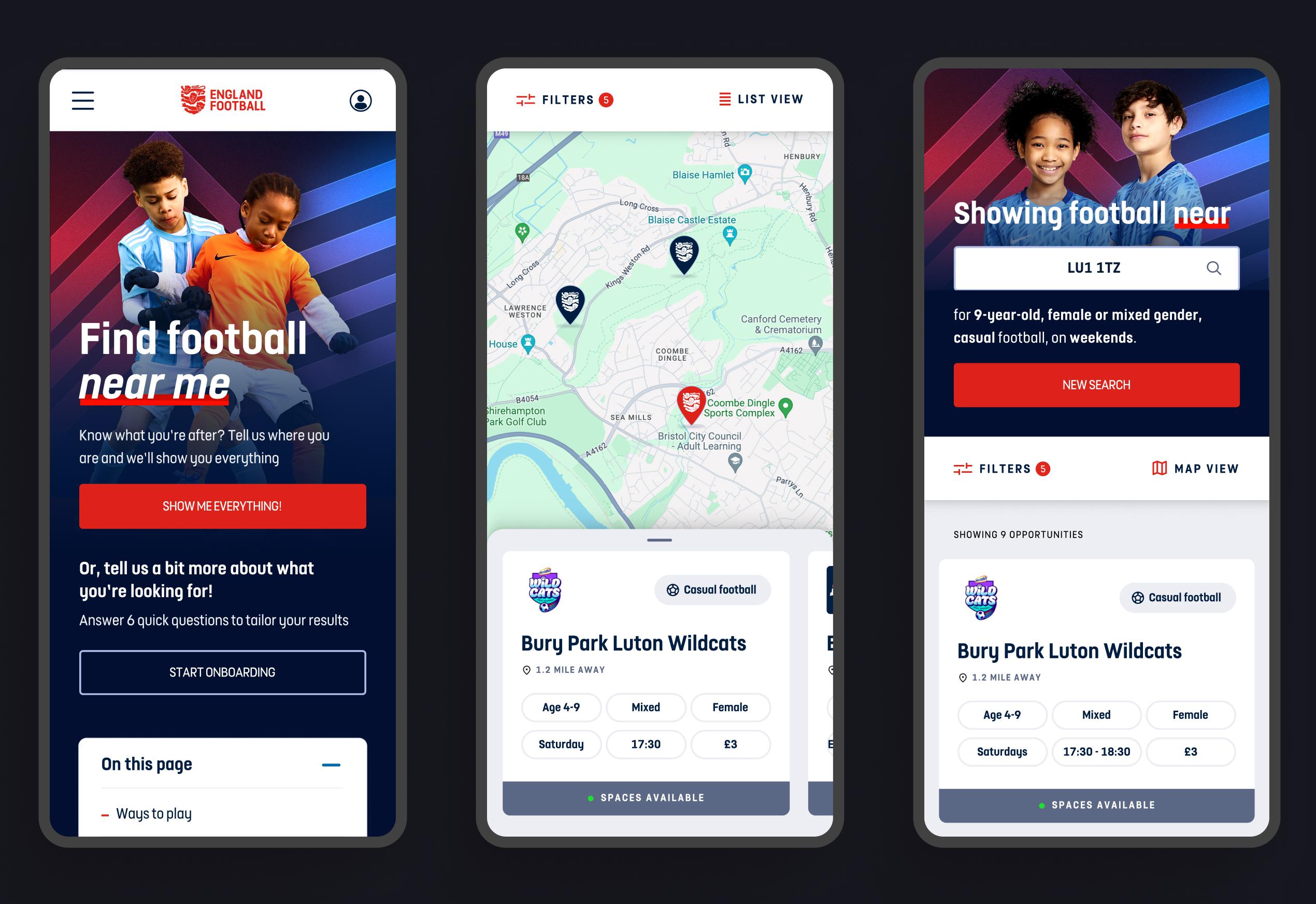
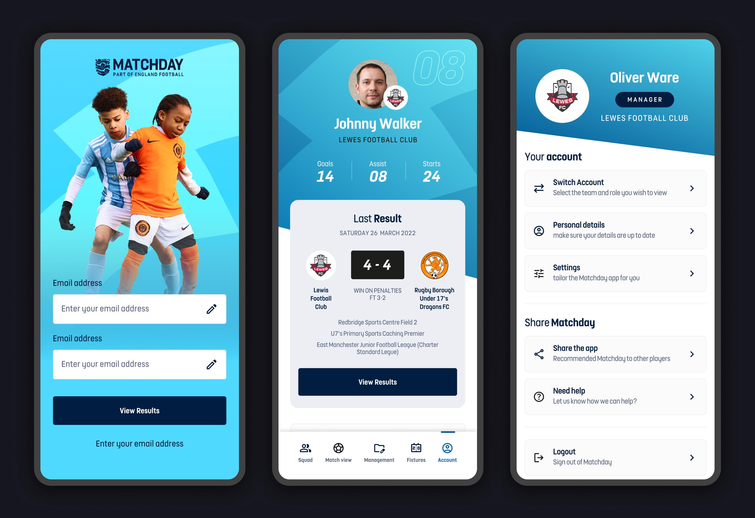
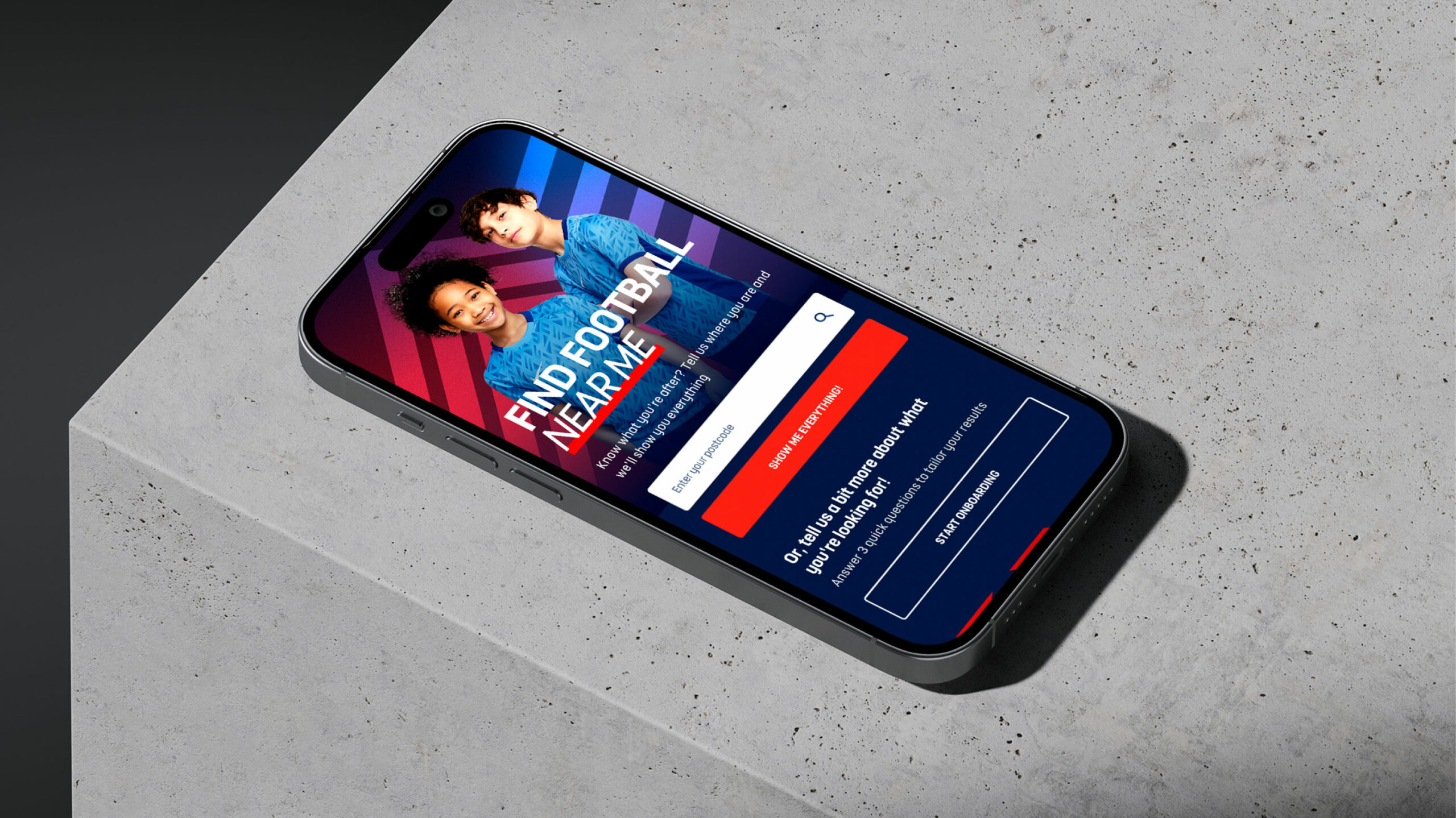
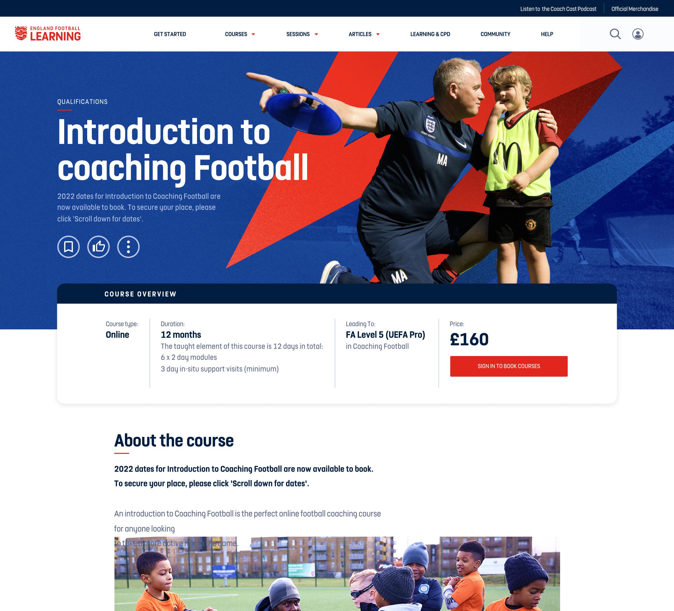
Below are examples of how the branding was implemented in the EFL UI. To see more, please refer to the EFL case study for additional details.
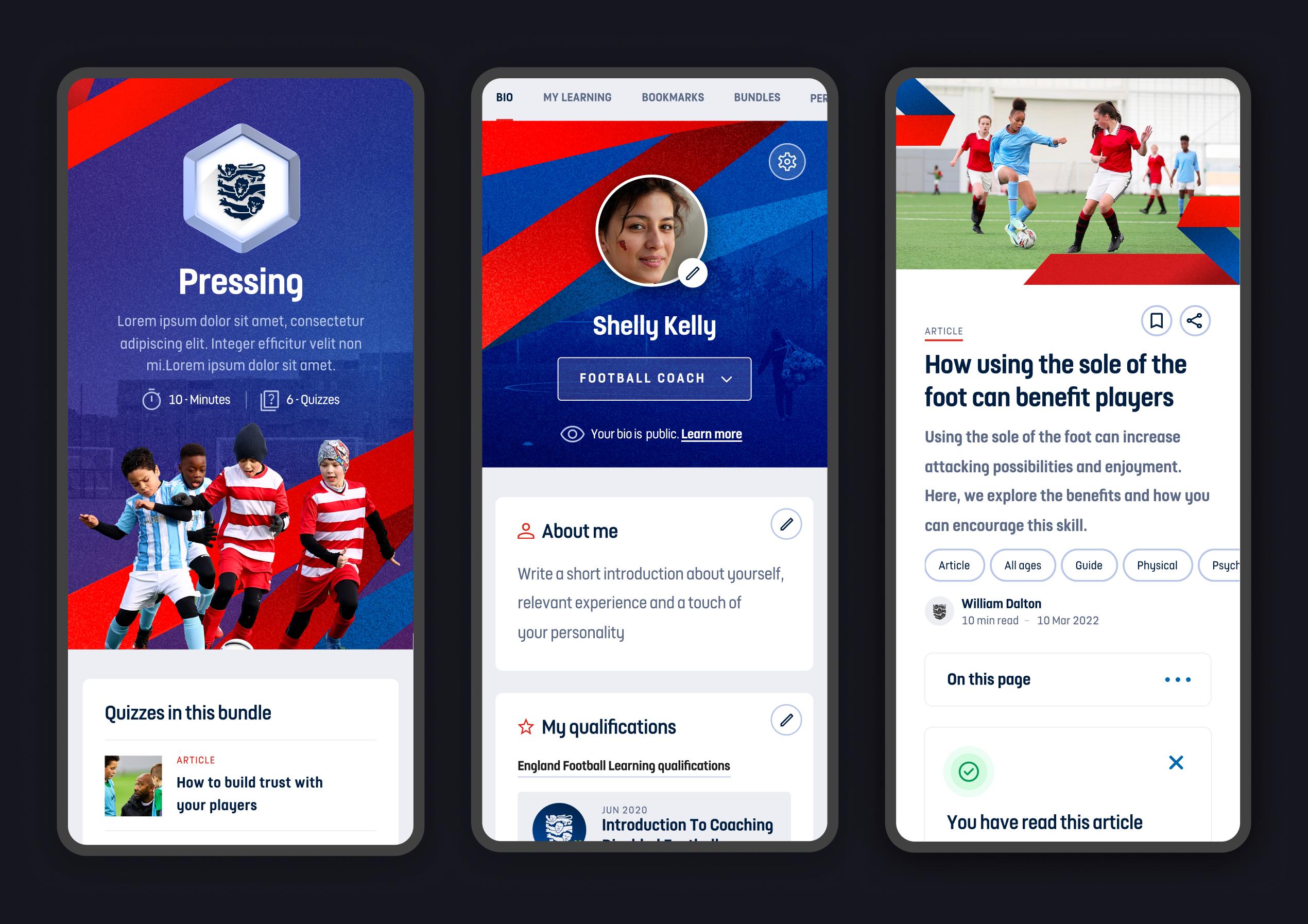
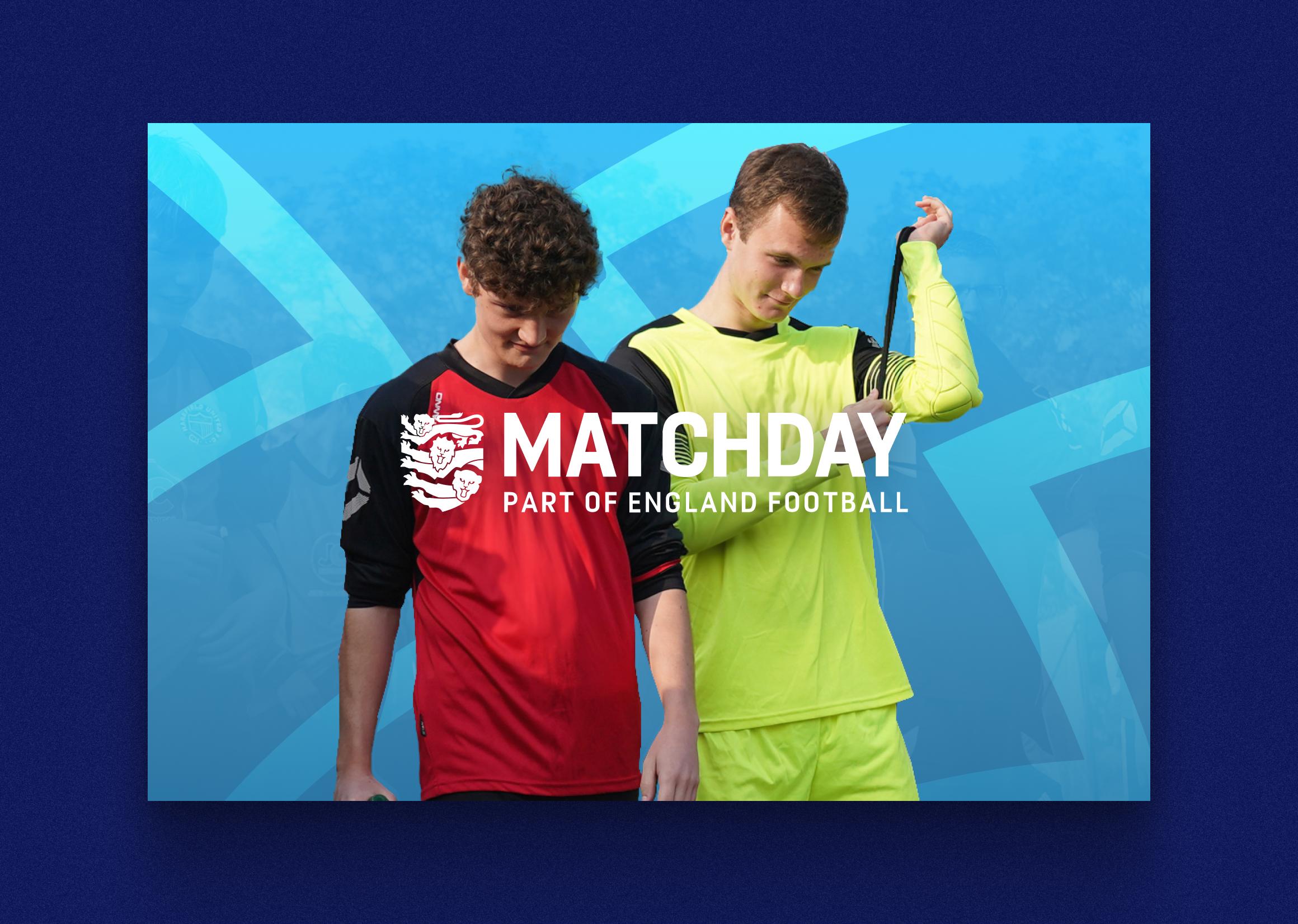
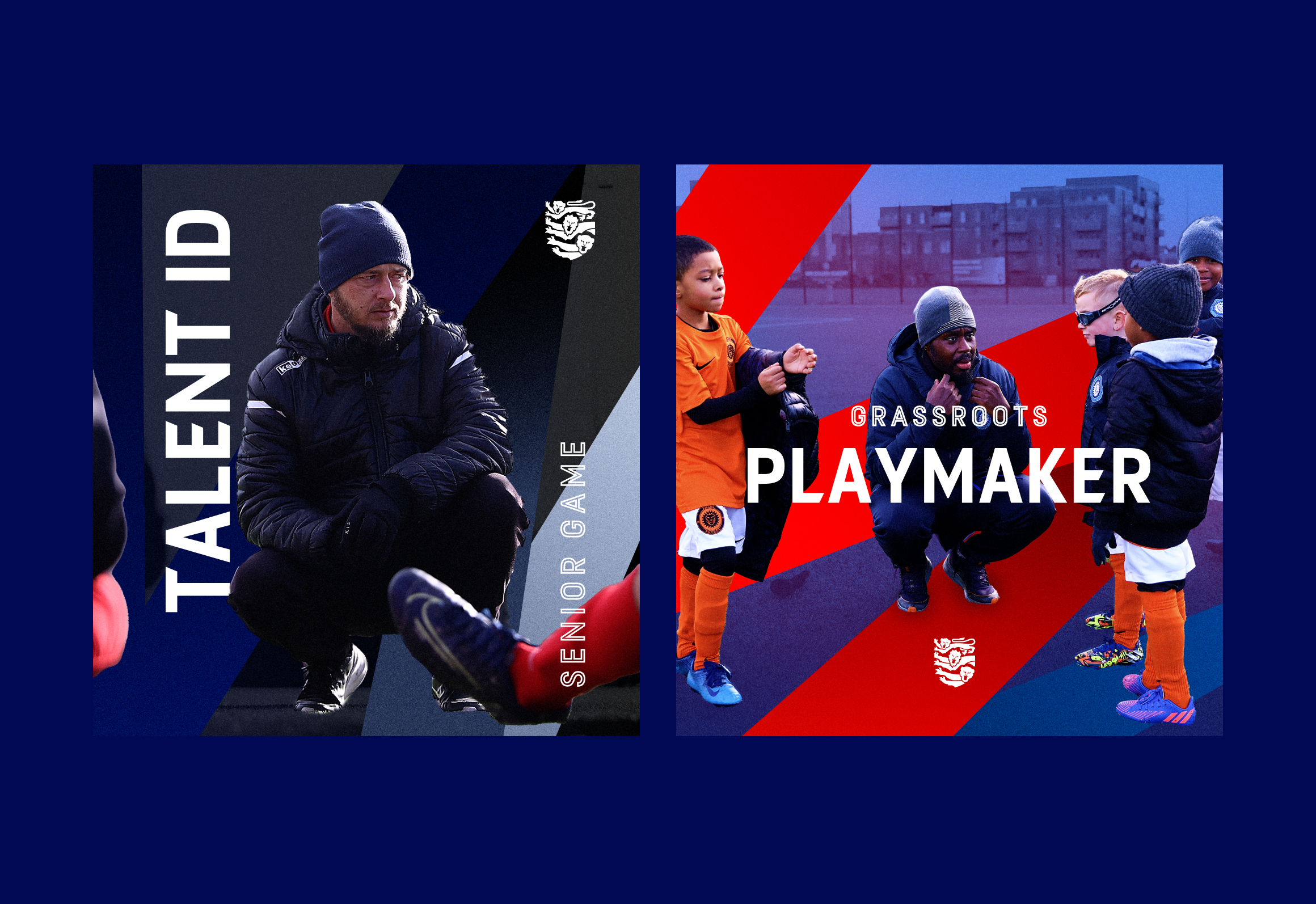
Brand standout
When presented side by side with EF content, the new EFL branding has the necessary pop to distinguish it from the rest of the ecosystem, while still feeling related to the over-arching brand.
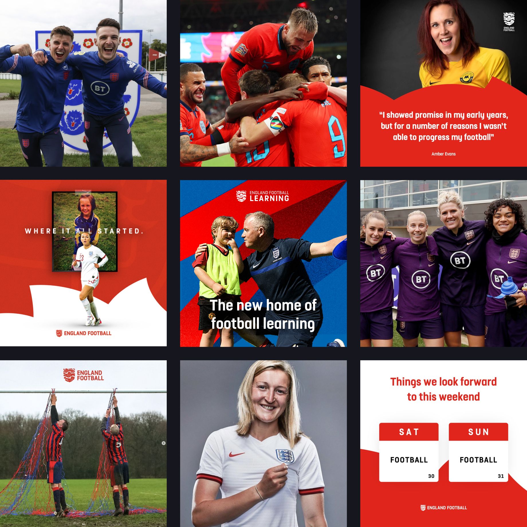
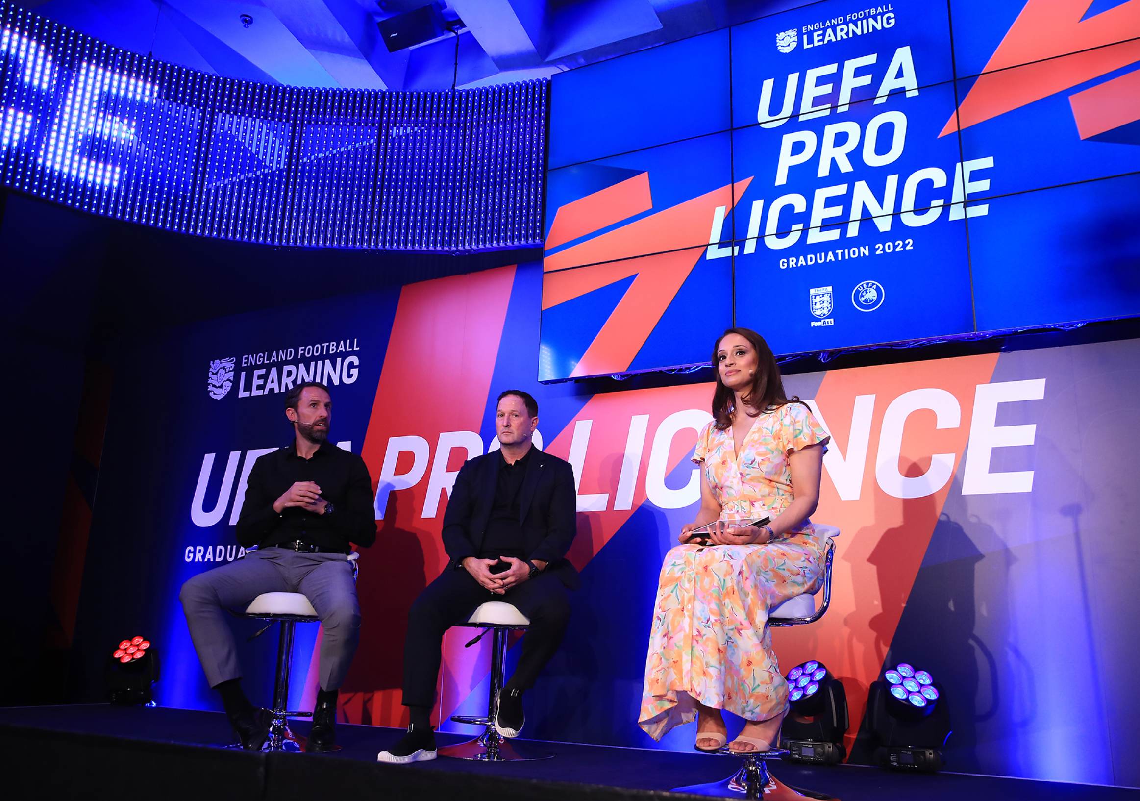
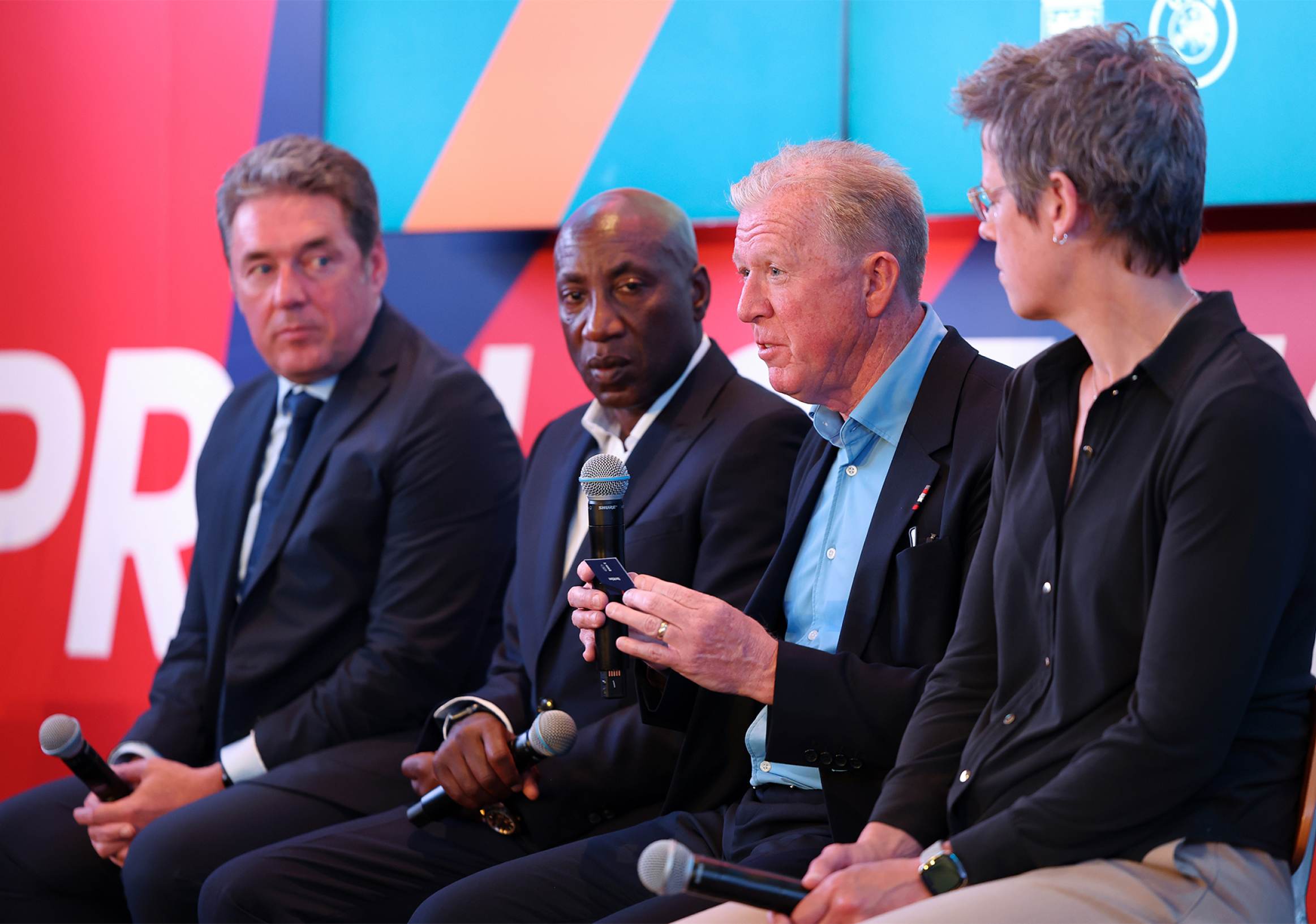
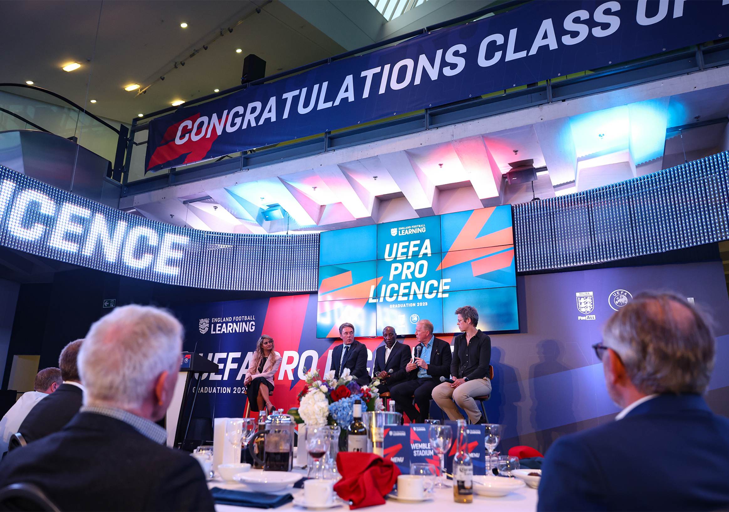
Branding in the wild
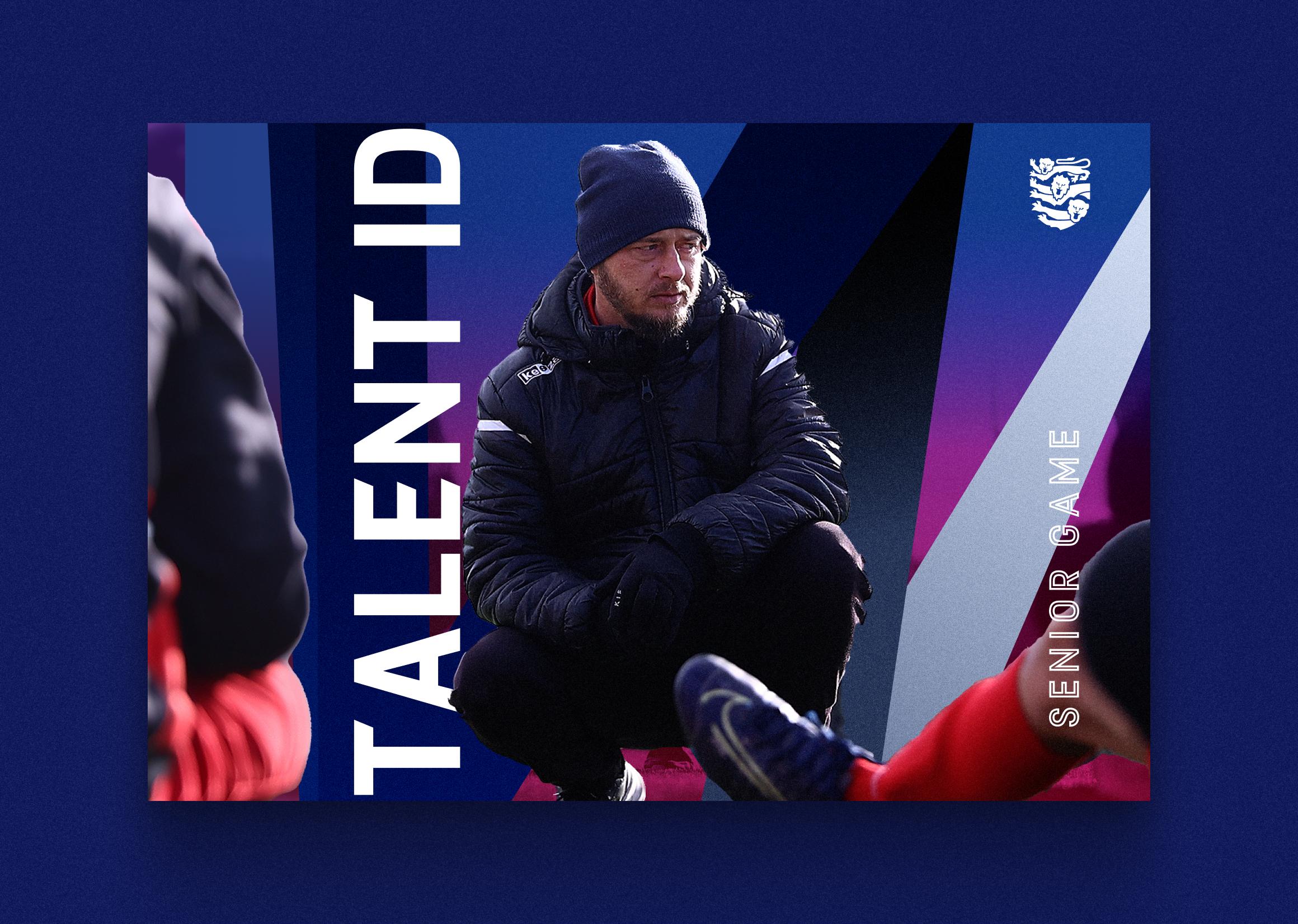
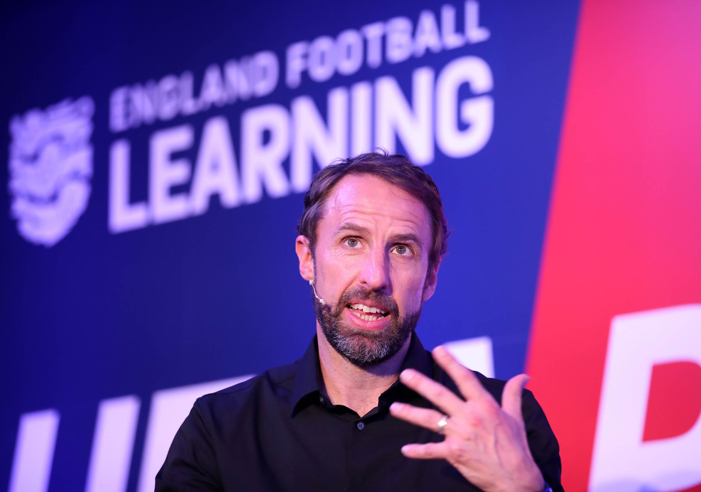
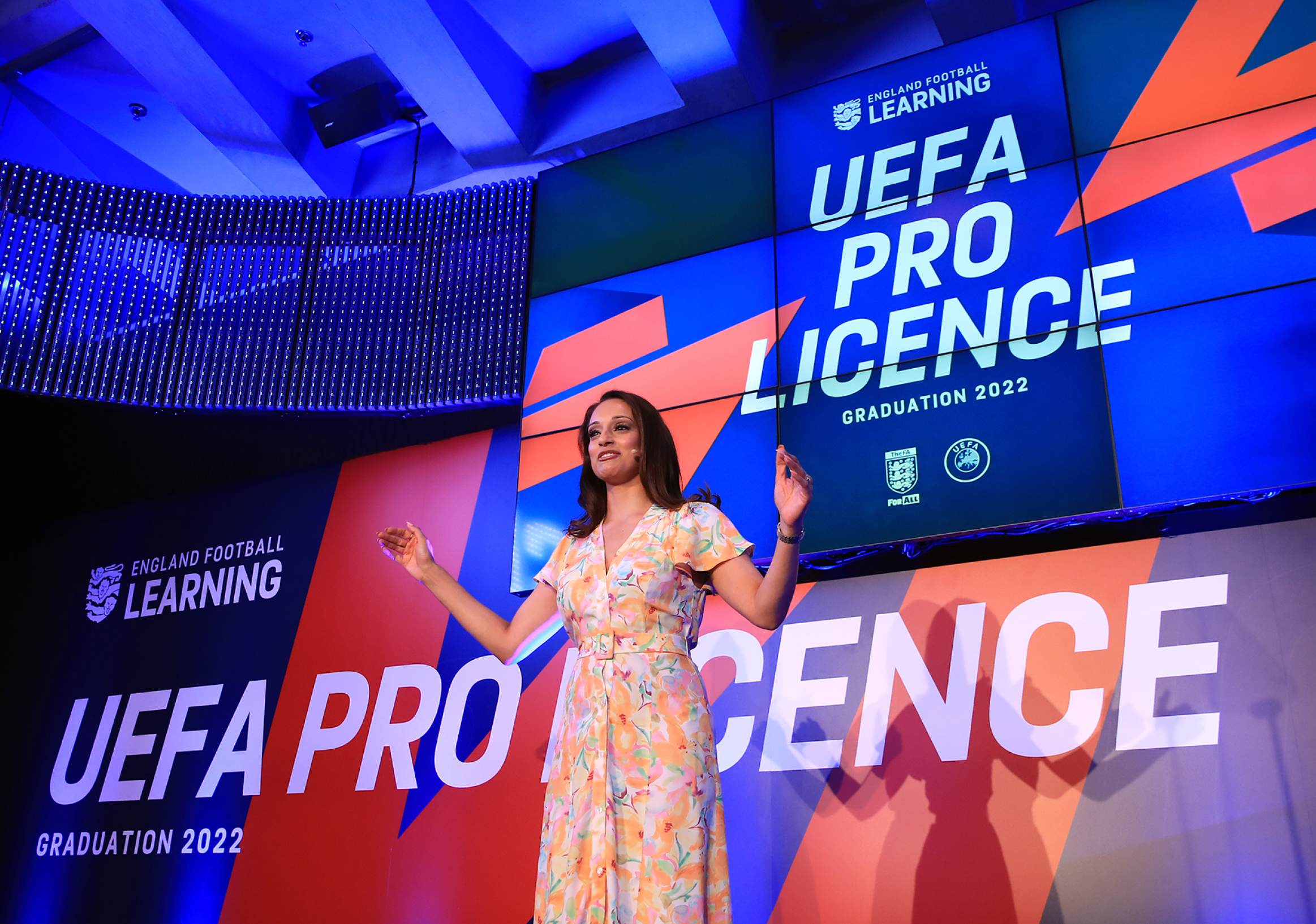
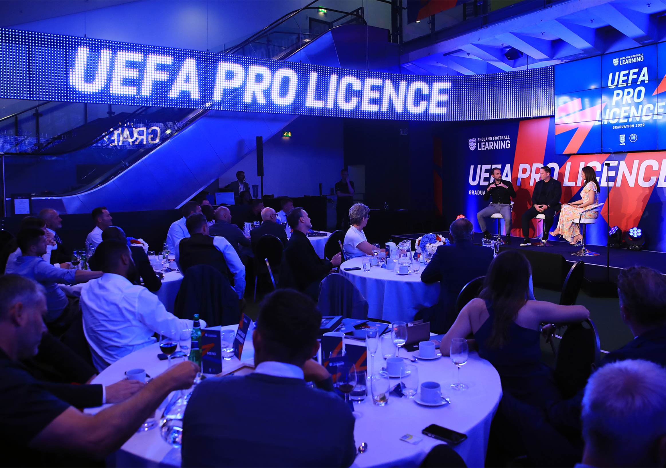
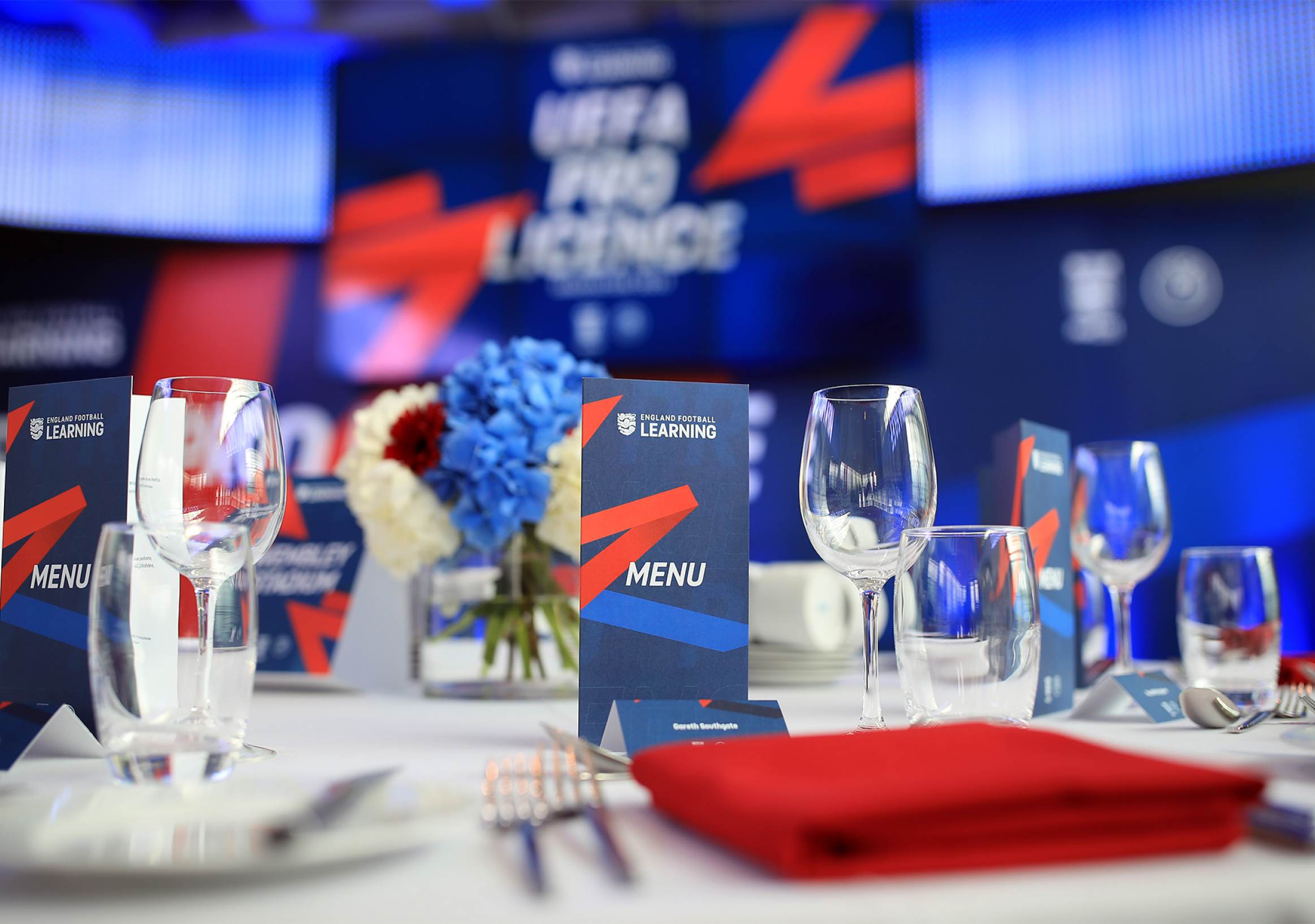
I felt a deep sense of pride when I witnessed other teams at the FA utilizing my brand assets. An illustration of this is found in the example below: the UEFA Pro Graduation set design. This event was hosted by Seema Jaswal and attended by Gareth Southgate, Steve Holland, and Steve McClaren.
Brand differentiation
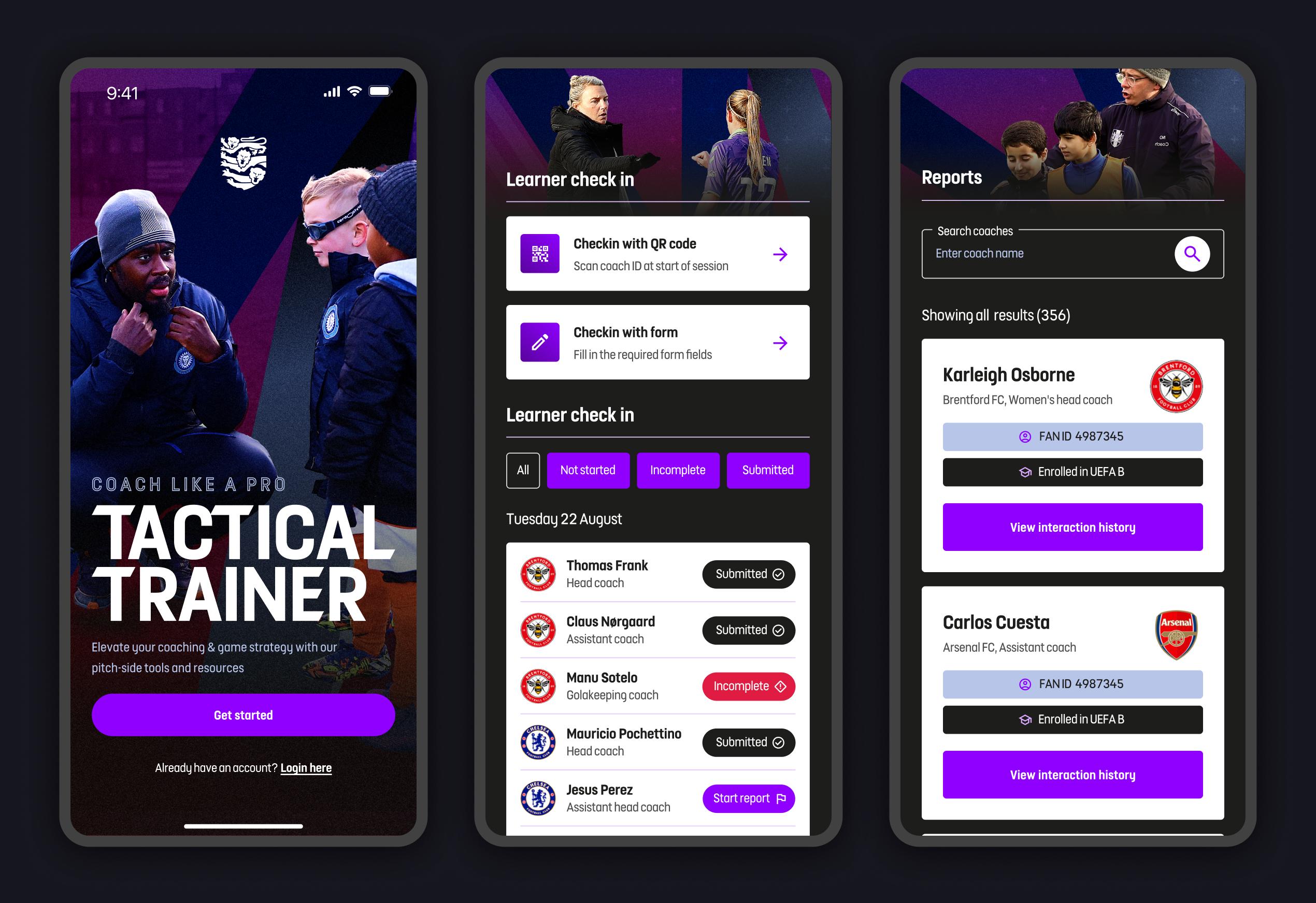
Building on the tremendous success of the England Football Learning branding, I was commissioned by the FA to contribute to developing a new branding direction for the broader FA product ecosystem. The goal was to establish a cohesive visual language for all UI elements within the England Football umbrella. This involved crafting distinct color palettes and key brand assets to distinguish between various products and prevent brand dilution.