WEBSITE DESIGN
PRS for Music
Reimagining the content experience for M Magazine
MY ROLE
Lead UI designer
Design system
Art direction
Motion graphics
CLIENT
PRS
The background
PRS for Music is a society of songwriters, composers and music publishers, which collects and distributes music royalties on their behalf. It is one of the world’s most efficient combined rights collecting operations, offering its members more money at less cost, and it also protects music against piracy, licenses music to business and influences policy at national and international level.
Disparate technology platforms and methods of physical and digital communication needed to be transformed in order to drive growth and satisfaction by empowering members, customers and employees to thrive financially and professionally.
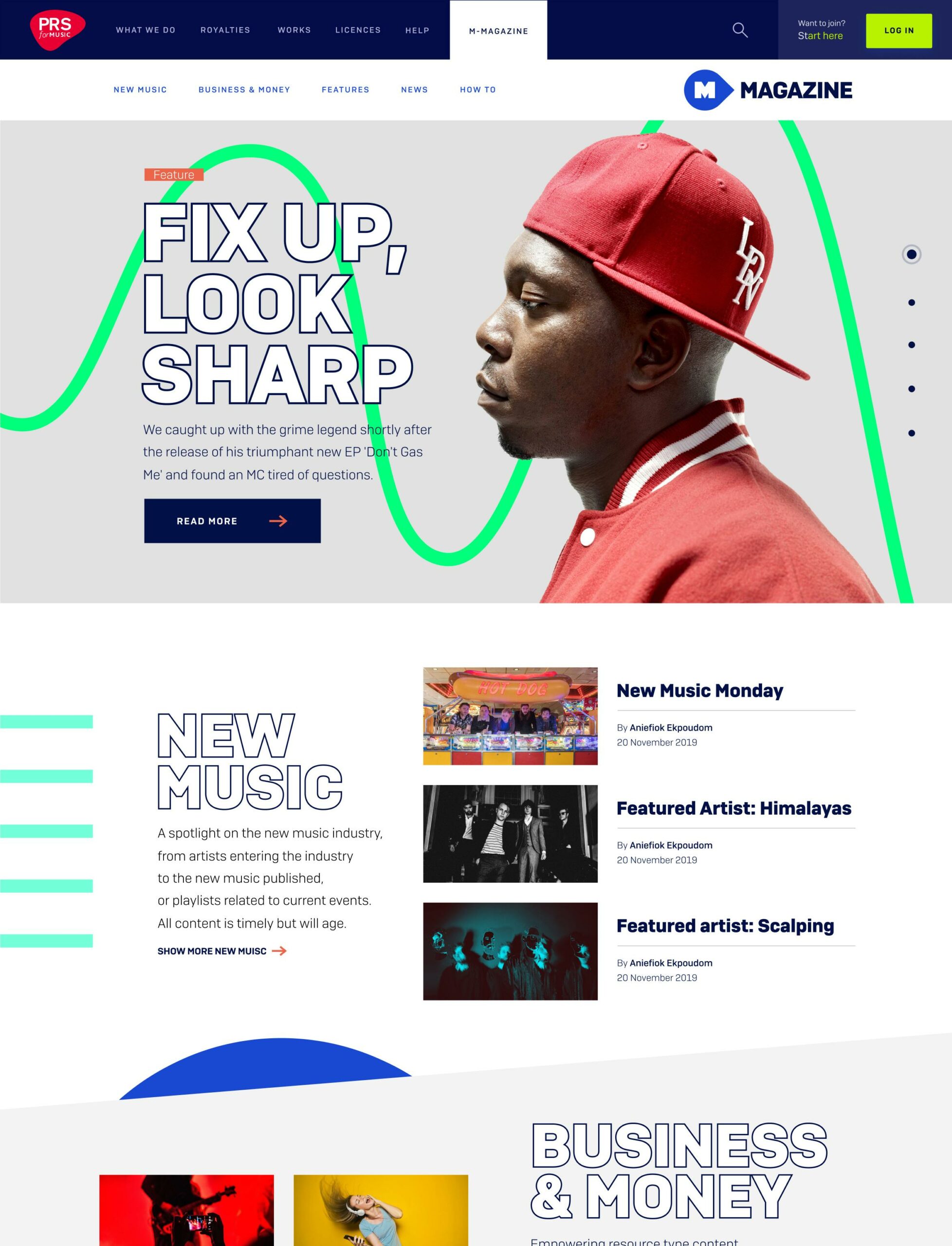
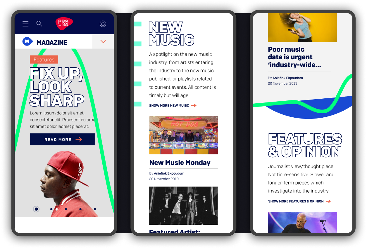
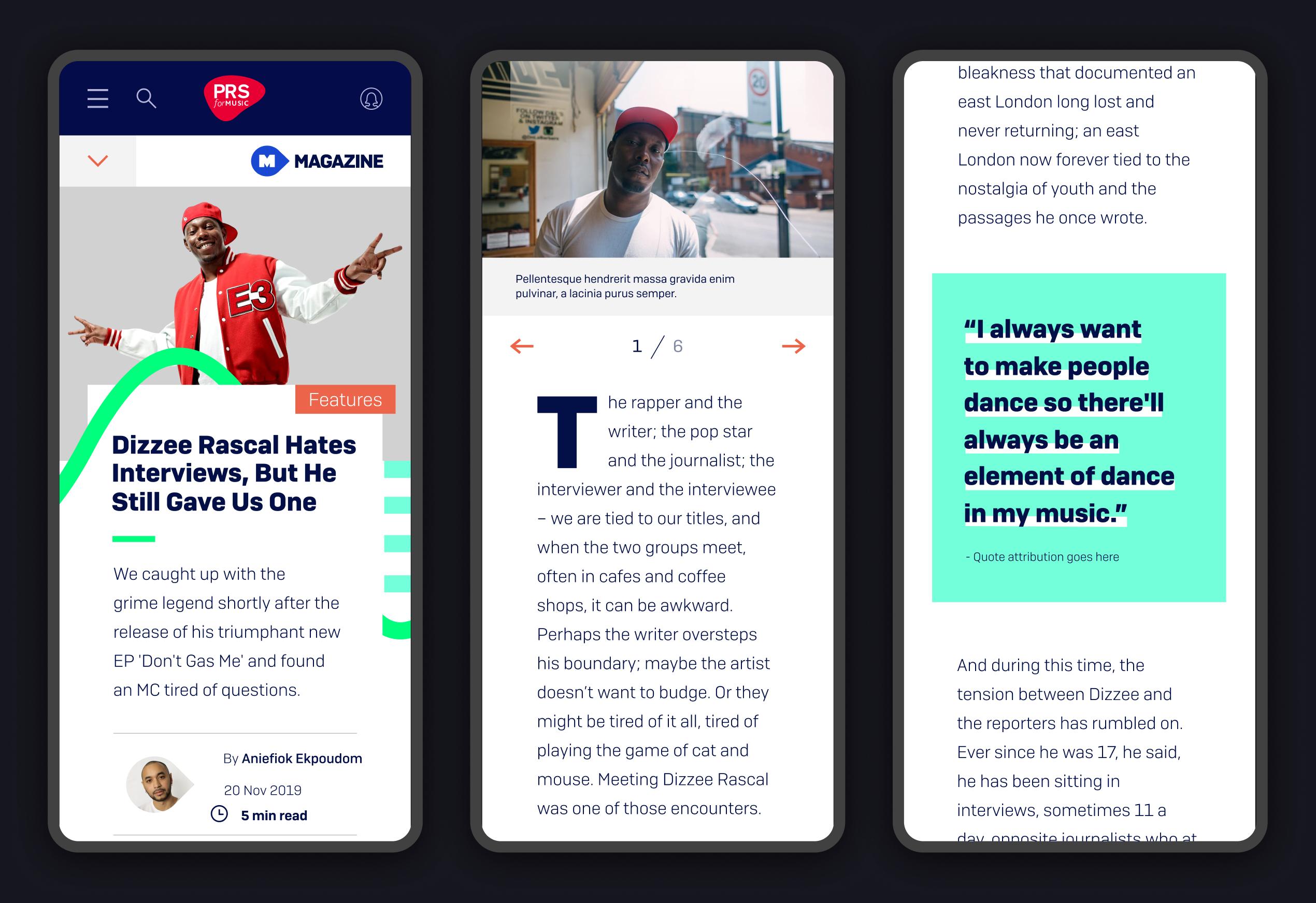
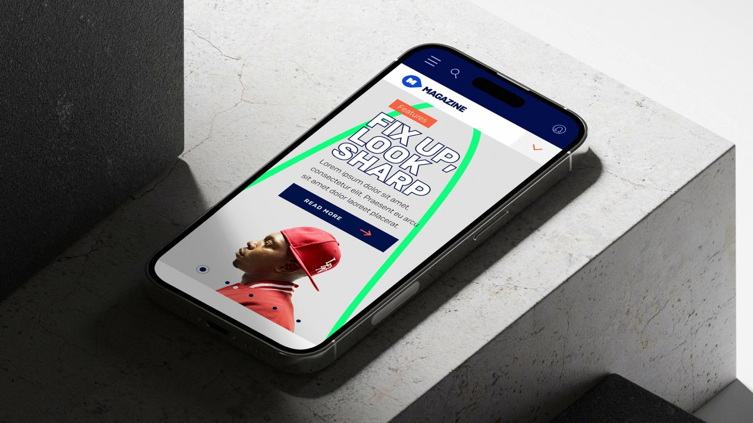
PRS aimed to transition their print-based M-Magazine into an online platform to reach a broader audience within their membership. As part of this transition, I collaborated with their internal design team to create a new brand for M-Magazine.

Brand Exploration: Reimagining M-Magazine's Identity
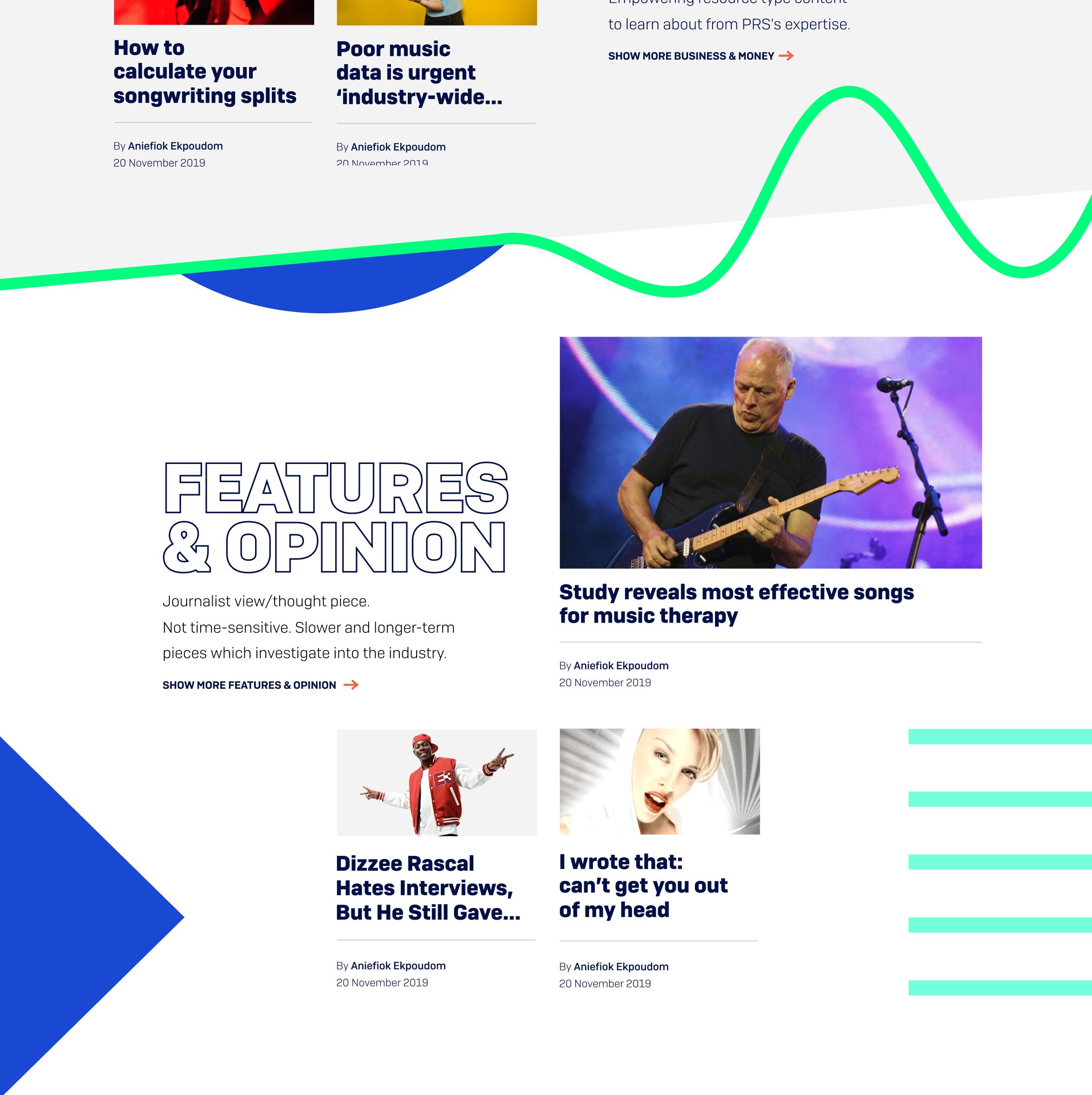
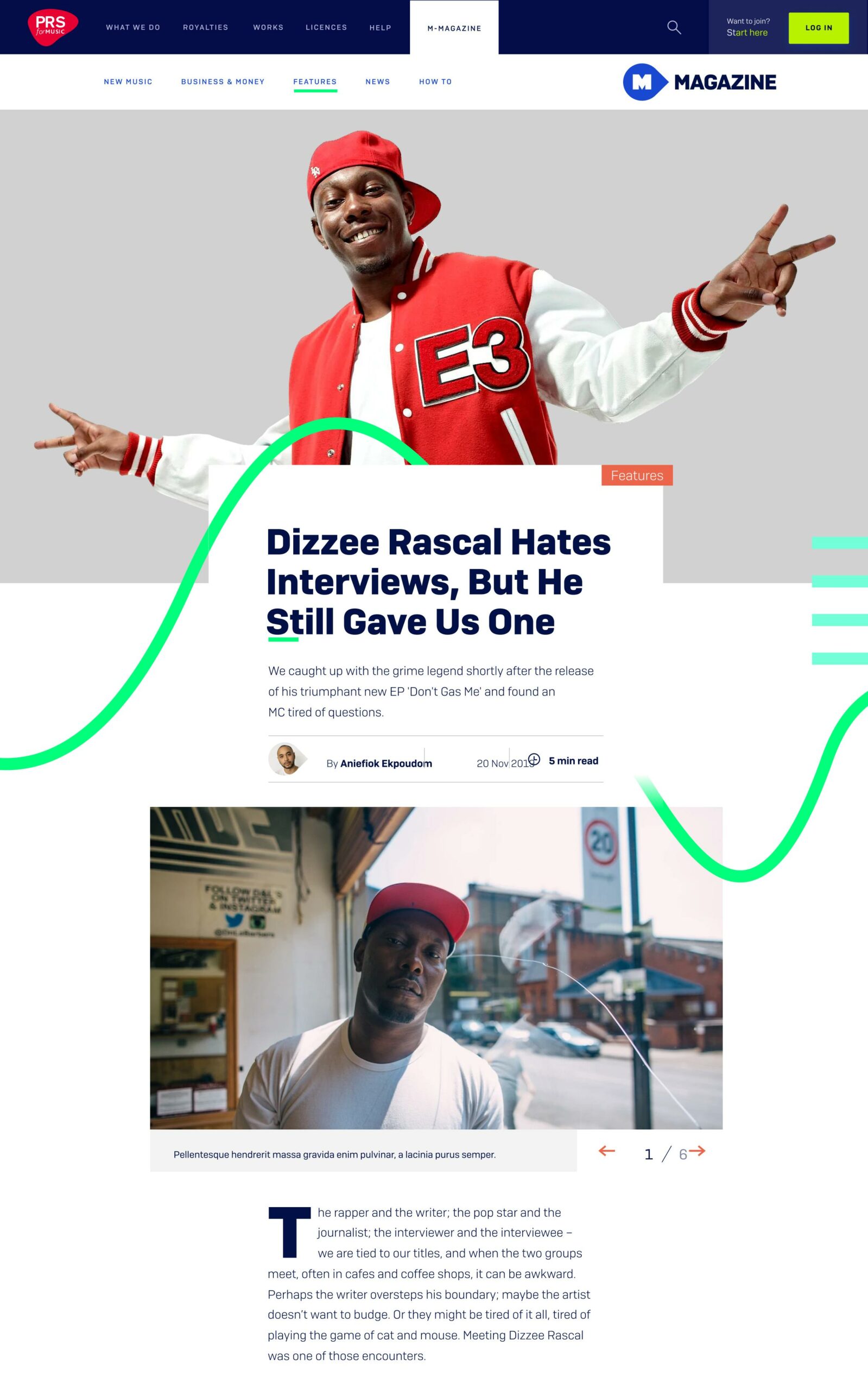
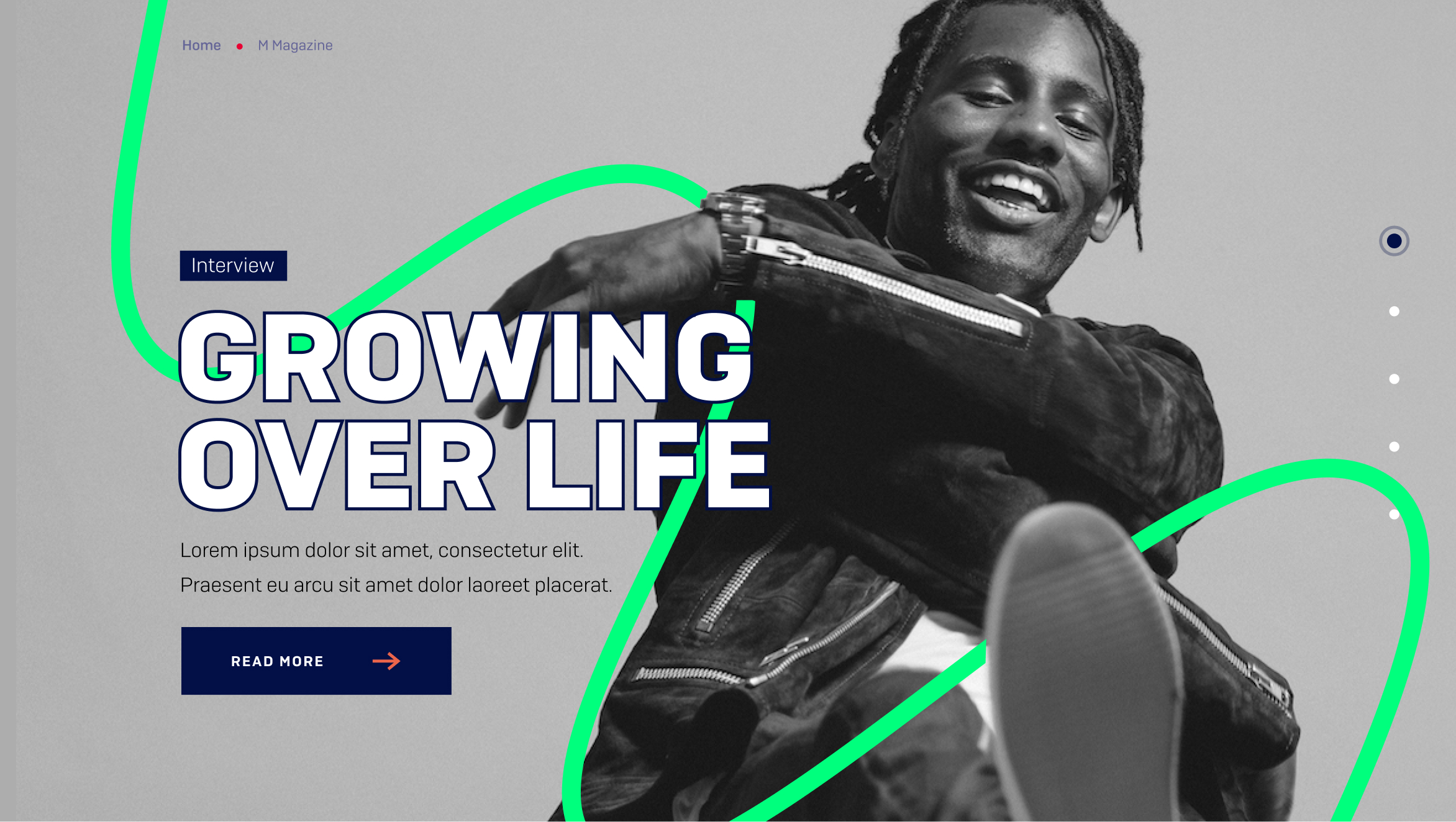
In redefining M-Magazine's branding, we ventured into the heart of our core PRS corporate branding – the stave. Traditionally a cornerstone, we saw an opportunity to infuse it with rebellious creativity that mirrors M's dynamic nature. Our vision? To unleash the stave, breaking free from convention, embracing a riot of colors, morphing into a vibrant sound wave that captures M's bold, unconventional essence.
Taking this concept a step further, I sought to enhance its impact by refined the appearance of the sound wave, ensuring it intertwined more intimately with the artist. I envisioned motion breathing life into the sound wave, elevating the brand presence to new heights.
Detaching the sound wave from the stave emerged as a strategic decision, enabling us to spotlight it as the hero element. The standard stave, once the focal point, now plays a supporting role, adding depth and rhythm further down the page.
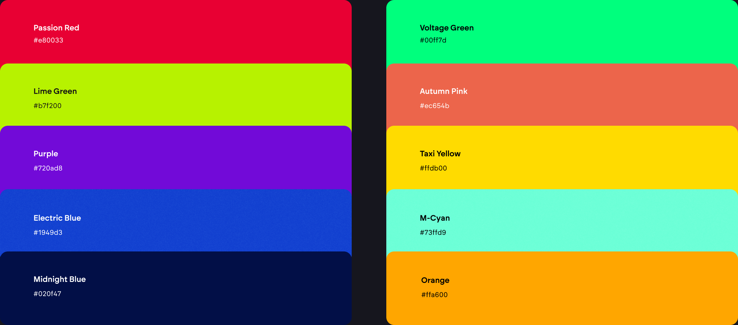
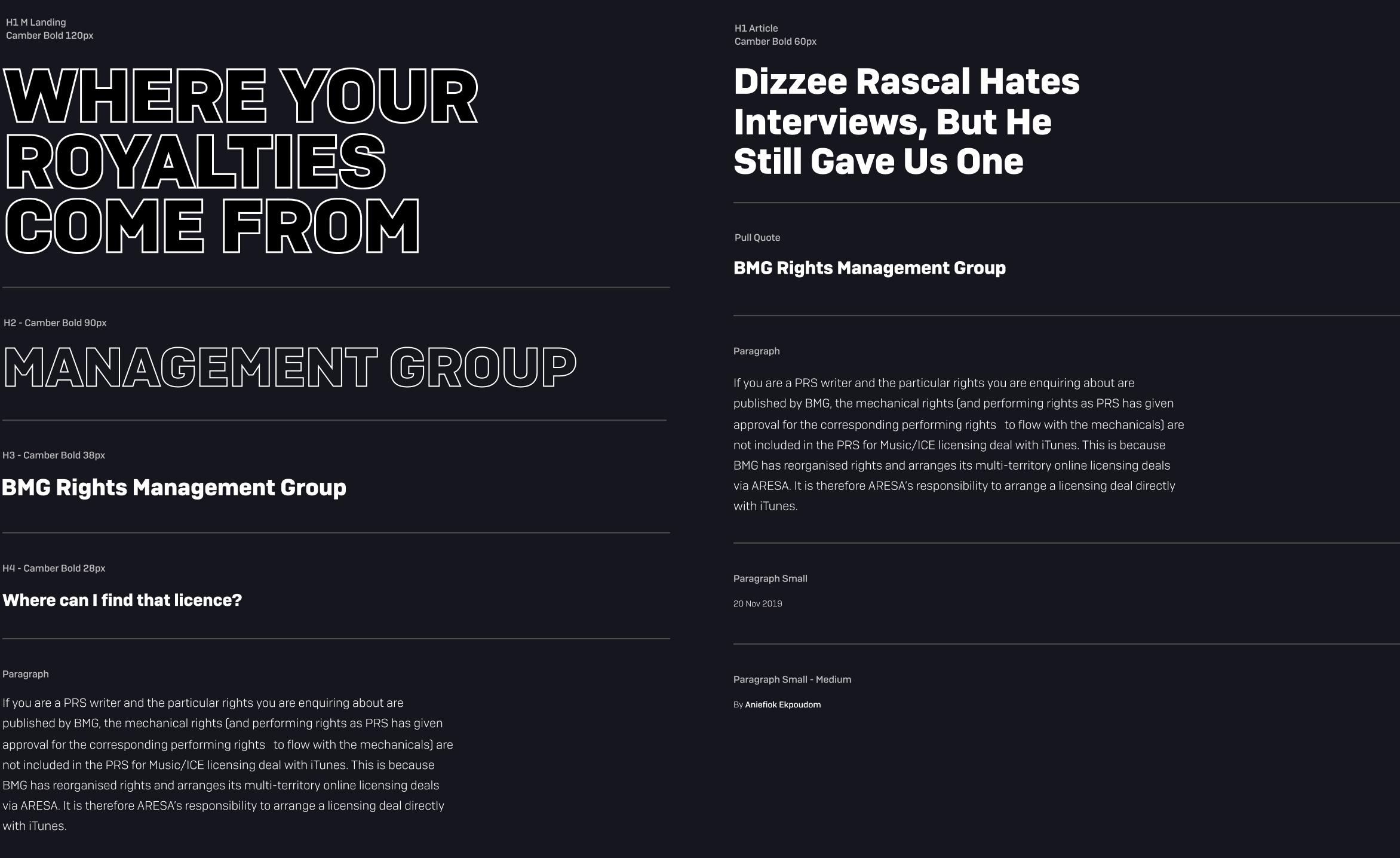
Colour and type
As part of the brand exploration, I set about creating an editorial-type scale that would reflect the editorial nature of M-Magazine. Making use of white space, I aimed to achieve a good contrast between headlines and sub-copy, adding rhythm to the page designs.
The type scale needed to provide enough flexibility for the PRS content editors who would be crafting the pages on M-Magazine day-to-day. A lot of collaboration between myself and the internal content team helped us refine the type scale, along with the wide range of colours available through the PRS brand guidelines.

Creating an MVP that builds the foundations for a richer on-site experience while identifying opportunities for personalisation
As a key member of the team, my primary focus has been on enhancing the user experience and user interface design in collaboration with PRS. I played a central role in identifying crucial tasks and journeys for improvement, leading the effort to repurpose content from M magazine and seamlessly migrate it from its stand-alone WordPress website to the main PRS website and Sitecore platform. Working closely with PRS's internal design team, I've actively contributed to refining their brand guidelines and meticulously designing the entire digital experience. This project marks the inaugural application of PRS's new brand, and my emphasis on user-centric design has been paramount. I've led initiatives to optimize the membership experience, conducting rigorous testing with members to ensure the interface's usability and value.